

By Content team at Reyal Design, Reyal Design
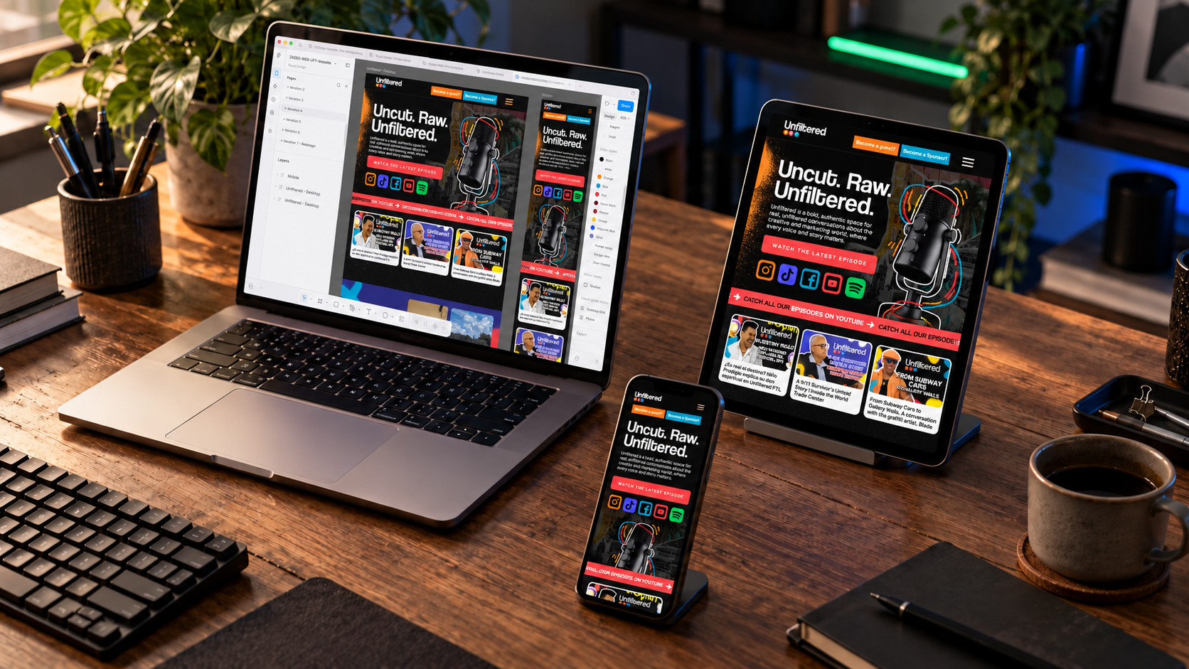
In today’s digital landscape, “responsive web design” (RWD) has become an essential practice for brands striving to enhance their online presence. RWD refers to the technique of crafting websites that adapt seamlessly to various screen sizes and orientations, fostering an optimal user experience across devices. For ambitious brands, mastering responsive design is crucial for capturing attention, increasing engagement, and driving business growth. This article delves into vital mobile responsive design practices that will empower brands to effectively reach and resonate with their audience.
By exploring the intricacies of mobile-first design, fluid grid layouts, and adaptive strategies, this guide will unveil the essential techniques for establishing a robust digital presence. It will also highlight the importance of user experience (UX) optimization, which is pivotal for converting visitors into loyal customers. Furthermore, readers will learn the significance of consultations in delivering tailored responsive web projects, ensuring that the unique needs of each brand are met. Let’s dive into the key practices that can propel ambitious brands towards digital success.
To better understand how these design principles translate into consistent user interactions across various digital channels, consider the following academic perspective on cross-platform usability.
Cross-Platform UX: Strategies for Consistent Digital Experiences Through a review of existing literature on UX design principles, platform-specific considerations, and measurement methodologies, a structured framework is synthesized to assess the consistency and seamlessness of interactions within digital banking apps across web browsers, mobile devices, and desktop applications. Enhancing user experience: Cross-platform usability in digital banking apps, 2024
What Are Mobile Responsive Design Techniques Essential for Ambitious Brands?
Mobile responsive design techniques are fundamental for creating user-centered websites that facilitate engagement and conversion. These techniques involve designing layouts and functionalities that adjust dynamically based on the device’s screen size, improving user experience, and ensuring accessibility. The significance of these techniques lies in their ability to enhance brand visibility and reliability, making it easier for users to navigate from a mobile device or tablet.
- Importance of UX: Prioritizing user experience in the design phase—ensuring fast load times, intuitive navigation, and easy access to content—creates a positive impression that encourages user retention.
- Adaptive Strategies: Brands should implement adaptive strategies, such as responsive images and CSS media queries, to ensure that all visual elements function correctly across diverse platforms.
- Dynamic Content Delivery: Using techniques to deliver tailored content based on user preferences can significantly improve user satisfaction and conversions.
How Does the Mobile First Design Approach Prioritize User Experience?
The mobile-first design approach centers on designing for smaller screens before scaling up to larger ones. This strategy emphasizes creating a streamlined experience for mobile users, which is critical considering the growing amount of web traffic from mobile devices. By focusing on the essentials, brands can develop a clear, uncluttered layout that prioritizes content.
- User Engagement: This approach encourages designs that enhance user engagement, leading to better interaction rates and overall satisfaction with the website.
- Implementation of Best Practices: Best practices include ensuring touch targets are appropriately sized, simplifying navigation, and optimizing content for faster load times – all of which contribute to a superior mobile experience that fosters returning visitors.
Which CSS Media Queries and Fluid Grid Layout Methods Enhance Responsiveness?
CSS media queries and fluid grid layouts are integral to achieving a responsive design that adapts seamlessly across devices. Media queries allow developers to apply different styles depending on screen conditions, such as size, orientation, and resolution.
- Examples of Media Queries: For instance, a media query can change navigation styles from horizontal to vertical depending on whether a user accesses the site via mobile or desktop.
- Fluid Grids: Adopting “fluid grid layouts” means using percentage-based widths for layout components, ensuring that the design remains proportional regardless of screen size.
Incorporating these CSS techniques not only enhances the responsiveness of a site but ensures a cohesive brand presence across all devices, reinforcing identity and message clarity.
How Do Adaptive Web Design Strategies Improve Cross Device Compatibility?
Adaptive web design (AWD) goes beyond typical responsive designs by using multiple fixed layout sizes that suit various devices. This ensures a more tailored experience for users, which can dramatically improve the way content is presented across screens.
- Importance of Adaptation: AWD is essential as it recognizes the unique aspects of different devices, allowing designers to optimize the layout and user experience specifically for smartphones, tablets, and desktops. By providing specifically optimized experiences, brands can significantly impact user retention.
What Are the Best Touchscreen Usability Practices for Mobile and Tablet Users?
Creating a seamless experience on touchscreen devices involves several best practices. These include ensuring that clickable buttons are sufficiently sized to avoid user frustration when navigating, maintaining adequate spacing between touch targets, and utilizing gestures effectively.
- Large Touch Targets: Buttons should be at least 44px by 44px to accommodate varying user dexterity.
- Intuitive Gestures: Incorporating swipe features can enhance interactivity, encouraging users to engage more deeply with the content.
Ensuring these practices are adhered to lays the foundation for an intuitive mobile experience that encourages users to explore and interact with your brand across all platforms.
How Can Fluid Grid Layouts Support Consistent Brand Identity Across Devices?
Fluid grid layouts play a crucial role in maintaining a consistent brand identity as they automatically resize and rearrange elements based on the device being used. This consistency helps reinforce brand recognition across platforms and enhances user experience significantly.
- Implementation Strategies: Brands can utilize grid systems such as Bootstrap or CSS Grid to create a consistent design. This ensures that no matter the screen size, the core visual identity remains intact, fostering familiarity for users.
By leveraging fluid grids, brands can ensure that their visual elements and product offerings are presented attractively, regardless of how users access their websites.
Why Is UX Optimization Crucial for Responsive Design Success?
User Experience (UX) optimization is pivotal in responsive web design as it directly impacts user satisfaction and engagement. Optimizing various elements, such as load speed, navigation, and usability, can significantly improve the overall effectiveness of a website.
- Load Speed Impact: Research shows that load times over 3 seconds can lead to up to 40% of users abandoning a site. Hence, ensuring optimal load performance is non-negotiable.
- Usability Factors: The inclusion of clear navigation, legible text, and accessible features greatly influence how users interact with a site, ultimately determining the success of the responsive design.
Which User Experience Factors Impact Load Speed and Touchscreen Usability?
Load speed is directly influenced by several factors including website coding efficiency, image optimization, and server performance. Prioritizing these elements can reduce latency and improve the user experience significantly.
- Coding Efficiency: Reducing the number of HTTP requests and optimizing scripts can greatly enhance load speed.
- Image Optimization: By using techniques such as responsive images and lazy loading, brands ensure that only the necessary resources are loaded for each device.
These optimizations not only lead to improved load speeds but also enhance usability on touchscreen devices, ultimately fostering better engagement and conversion rates.
How Does Responsive Design Influence Brand Perception and Business Growth?
Responsive design has a profound impact on brand perception. A well-designed, mobile-friendly site conveys professionalism and attention to detail, enhancing user trust and satisfaction.
- Evidence of Impact: Brands that embrace responsive design not only experience higher engagement levels but also report improved conversion rates—an essential aspect of business growth.
Investing in “responsive design” can lead to long-term growth benefits, making it a strategic priority for ambitious brands aiming to thrive in the digital marketplace.
What Role Does Consultation Play in Delivering Customized Responsive Web Projects?
Consultation services play a vital role in developing responsive web projects that are tailored to meet specific business needs. By collaborating with design experts, brands can ensure that their unique goals and challenges are addressed effectively.
- Customization Benefits: Through consultations, brands can convey their vision and receive tailored solutions that align with their objectives whilst ensuring optimal user experiences are created.
How Can Consultation Services Tailor Design Solutions to Ambitious Brand Needs?
Consultation services can adapt design strategies according to brand requirements, incorporating elements that resonate with desired customer engagement levels and preferences.
- Factors Considered: Understanding the specific industry, target demographic, and desired user interactions are crucial. Insightful consultations can lead to designs that significantly enhance engagement and brand loyalty.
What Are the Steps in Booking and Executing a Responsive Web Design Consultation?
The process of booking and executing a responsive web design consultation involves several key steps to ensure that projects move forward smoothly.
- Initial Assessment: Engage in discussions to assess specific branding desires and user experience expectations.
- Strategy Development: Experts will explore possible strategies tailored to identified goals.
- Implementation Monitoring: Post-execution, firms often monitor the implemented strategies to ensure they align with projected outcomes.
Understanding these steps can streamline your approach to consultations, ensuring that you receive a customized design solution built specifically for your brand.
How Do Responsive Images and Performance Techniques Enhance User Engagement?
Responsive images are an essential aspect of modern web design that directly affects user engagement. By ensuring that images are appropriately sized and optimized, brands can prevent slow load times and create a smoother browsing experience.
- Performance Techniques: Techniques such as using the srcset attribute for images allow different resolutions to load based on the device’s screen size, which significantly enhances performance.
What Are Adaptive Image Strategies That Improve Load Times Across Devices?
| Strategy | Technique | Benefit |
|---|---|---|
| Responsive Images | Use of srcset and sizes attributes | Reduces unnecessary data load |
| Image Compression | Techniques like WebP conversion | Improves loading speed |
| Lazy Loading | Delays loading images until necessary | Enhances initial load performance |
By implementing these adaptive strategies, brands can effectively increase engagement on their sites by delivering faster, more efficient visual content.
How Should Image ALT Text and Filenames Be Optimized for SEO in Responsive Design?
Optimizing image alt text and filenames is crucial for SEO within responsive designs. These elements not only improve accessibility but also help search engines understand the content of the images.
- Importance of ALT Text: ALT text provides context to images for search engines and assists visually impaired users. Best practices suggest using descriptive phrases that include target keywords naturally.
By ensuring that these components are optimized, brands can enhance their search engine visibility, driving more traffic to their sites.